Project Brief
In this project my group and I created an app to help with a civic issue. My team chose to look specifically at resources for volunteers to aid with homelessness. The project specified the use of Figma to create an app prototype for Apple devices. Additionally, the function focused on enhancing the access, efficiency and awareness of volunteering to aid the homeless population.
Project Idea
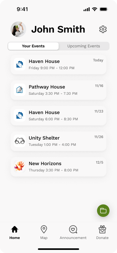
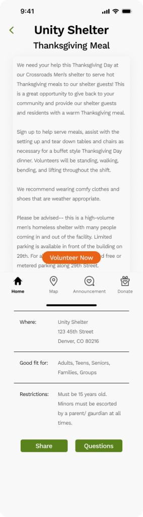
The main goal of the project was to create a central location for people looking to volunteer with homeless resources. We wanted to make this app a location where the user could volunteer, locate, donate, and find the latest news about events and urgent needs in the area.
In researching our target audience, we found the primary user to be a committed activist. This person spends many hours each month at a few organizations making a difference in their community. Our secondary user would be people interested in helping but not always being able to commit their time.
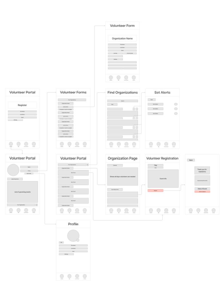
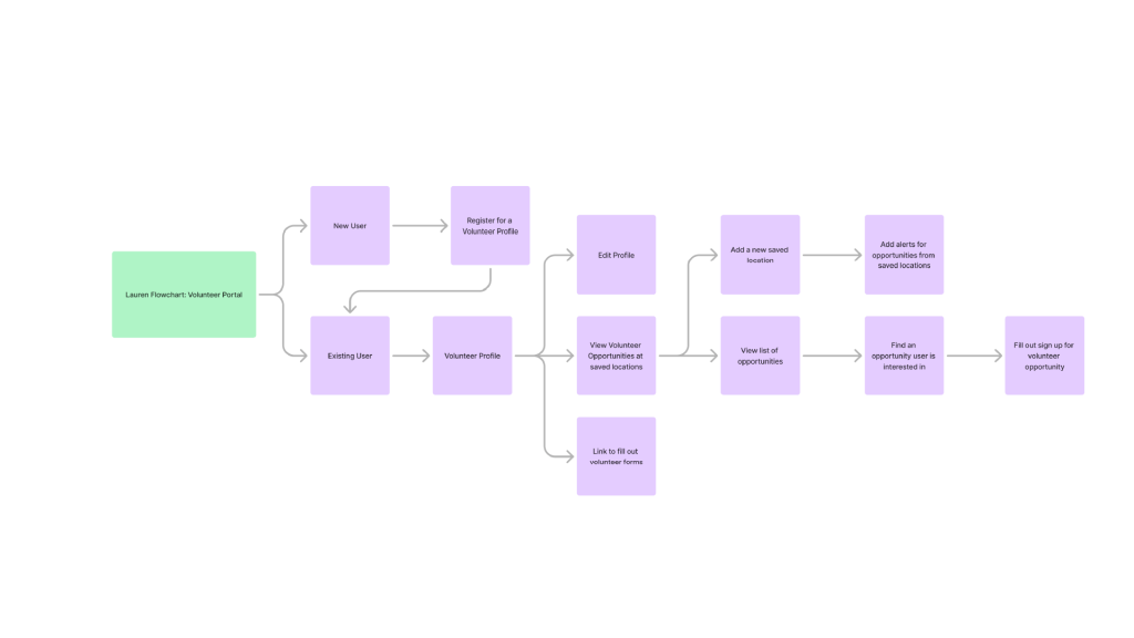
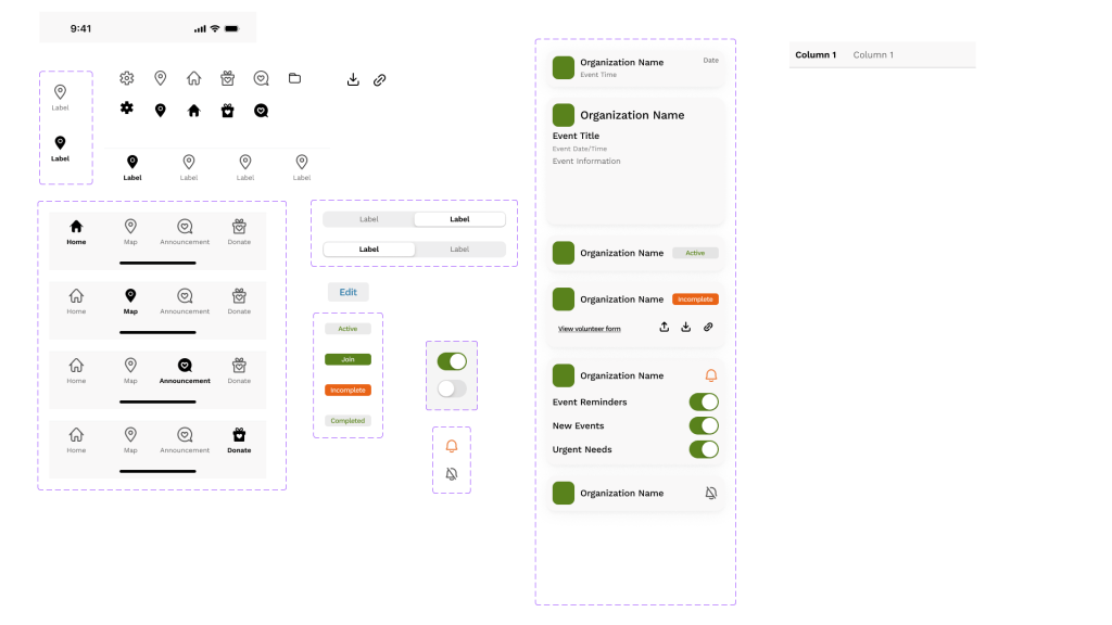
My Feature – Volunteer Portal
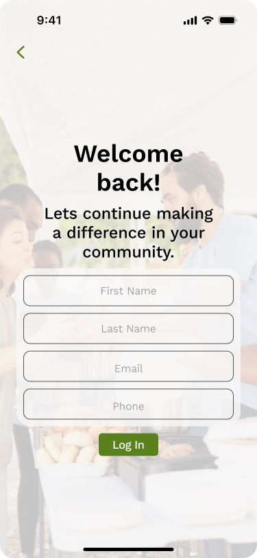
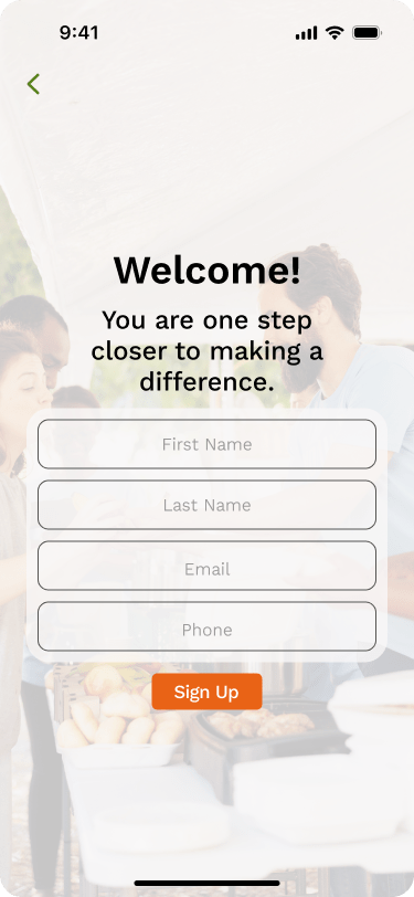
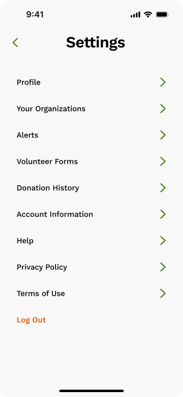
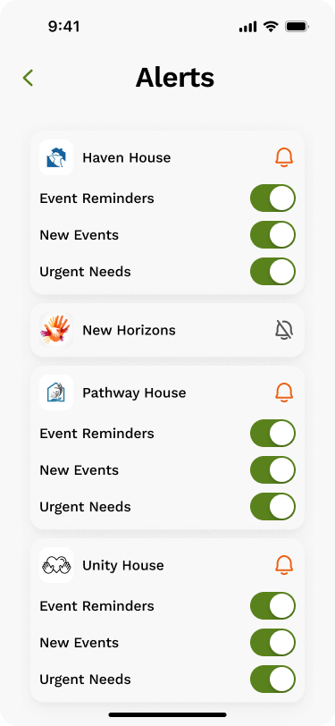
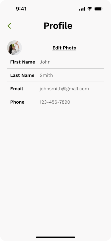
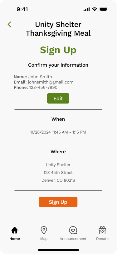
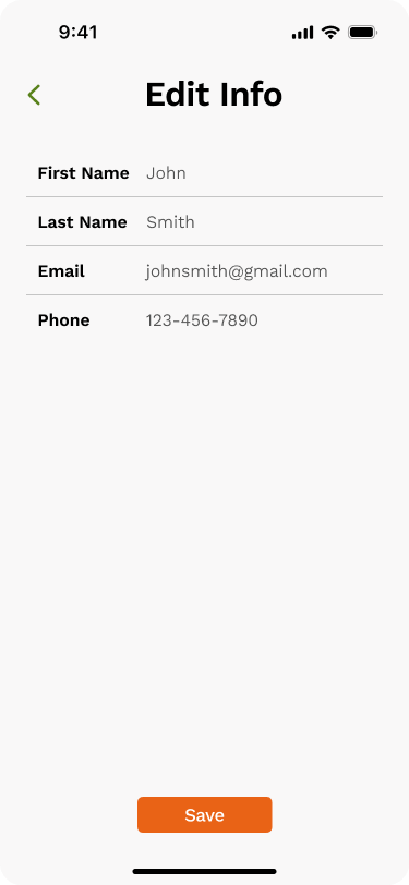
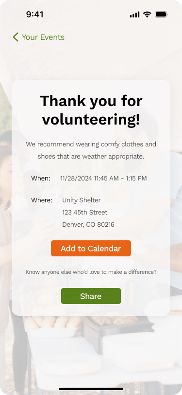
This page provides the user with a personalized landing page. It will be a place to create an account for easy sign up with participating organizations. Additionally, this page will give the user a location to save specific locations or organizations of their choosing and allow them to quickly sign up for volunteer opportunities with these saved places. In creating an account any necessary registration paperwork will also be linked here. Finally, this location will show the user events they are registered for.
This project was completed mainly in Figma and a little bit of work in Illustrator. After discussing the project with my group, I created a flow cart for my page. This was followed by a wire frame for my section. After receiving feedback, I moved into the final app design. For this section I created multiple components to make my pages cohesive including the navigation menu for the bottom of the app. I made this nav bar in each state so my group could easily use it in their sections. All the components I used in my portion were also available for my group to use. Finally, I prototyped my section of the app and added any additional pages needed for function. In prototyping I connected any necessary sections to other app features.
Design Research and Planning
Based on all the parts included in my page I really wanted to maintain a clean interface for the user. While planning this part of the app I wanted to make all the parts easily accessible when necessary and less used parts would be less prioritized on the main page. In the planning I looked at many applications that a large portion of people use. This included apps like Instagram, TikTok, WhatsApp, and Amazon. From this I tried to keep many consistent symbols and feature placement.
Individual Screen Design


Prototype Video
Areas of Improvement
Within my design I think the two sections of the main page could potentially become two full pages in the app. I also wanted to find a way to incorporate more photos or visuals, but I couldn’t find a way I thought looked good. Finally, I think the section for volunteer forms could be further refined to make it more clear for the user.
For the overall app I think we could have worked together better to make a more cohesive visual style across all our pages. I also found that a few parts from my section overlapped more with my teammates so more communication for how we could connect those would improve the app as a whole.
Overall, I think the app would benefit from being tested by potential users for where further refinement would be necessary.
